In 2007, Apple’s iPhone revolutionized consumer app development (known as B2C). The skyrocketing demand for mobile ushered a new era of digital transformation for consumers – and today, mobile apps are an integral part of our lives.
But the transformation for enterprise employee-facing applications (B2E) has not been as streamlined. Consumers got used to a mobile app to meet their every need, but enterprise employees often continued working with large, clunky systems that hadn’t been designed for mobile.
Now comes Covid-19. Mobile has already been on the rise for years, but the pandemic has electrified the shift. According to Statcounter, in the first quarter of 2020, mobile devices (excluding tablets) generated 52% of global website traffic and have consistently hovered around the 50% mark since the beginning of 2017.
Enterprise employees are now working from home, often on smaller devices. Companies that had been slow to accept digital transformation now have to accelerate the pace of change – to help their employees adjust to an unfortunate situation and also remain productive. This is no easy task when business relies on desktop-based systems that require workflow support and UI that could reflect a similar experience on smaller devices.
The iPhone changed the way we lived, but COVID-19 is changing how we work.
B2E mobile development was complex and cumbersome
Pega has been a cross-platform development company for many years. Long before 2020, it was clear that the B2C shift to mobile would eventually usher a similar shift in B2E. We knew that desktop-driven, advanced solutions could create complexities for mobile – small screens are less able to accommodate such advanced interfaces with lots of data or fields to fill and could affect application performance.
I saw this first-hand years ago when we were building a mobile app for an important client. As we were implementing for mobile, we had the following concerns:
- Multi-level formulas.
- Unnecessary custom interface built on top of our out-of-the-box solutions.
- Complications with proper building app experience.
- A lack of great industry examples in B2E mobile UI.
- Too many possible configurations to apply to a mobile app.
- Lack of proper visualizations.
All this would have had consequences for the final user and the client’s work. And if a user is frustrated with application response time, clunky interaction, and the visual UI appearance, they will immediately turn it off.
People were confused by the number of configurations. There were many discussions about mobile UX, but no specific rules to follow. And on the design side, we had to look up 50+ mobile combinations, had problems with keeping consistency on UI, had to keep a very close watch on updates and other security issues, and much more.
How Pega streamlined mobile design

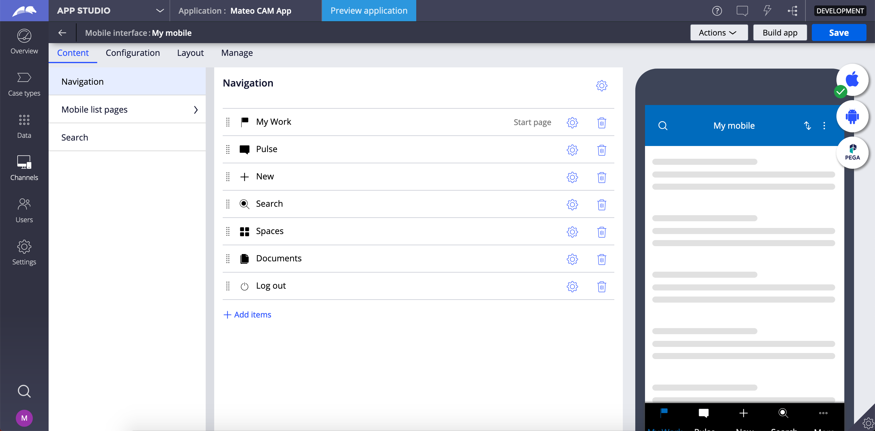
We took a “simple but powerful” mobile approach, with one goal – to get all of our design and development expertise, best practices, and business processes to the level of a “citizen developer.” The result is a new “low-code” experience for enterprise apps.
Low code allows designers to:
- Simplify advanced configuration to a single click.
- Provide a live preview mode to understand better how the design looks and functions.
- Eliminate troublesome configurations.
- Enhance collaboration between teams.
- Increase mobile app performance.
- Improve productivity while reducing user training.
Low-code mobile design gets results
One of the great results of that hard work was to see our own Pega teams use the low-code initiative to improve their business processes. Our Global IT Support team used it to build a fast and fully native mobile app for notifications and collaboration use. The marketing team built a request system base on it. People liked it!
What’s more, Pega also introduced the Constellation design system – a low-code design system for the enterprise. A simple and user-friendly interface allows designers to complete their tasks without confusion. Big data is accessible, and a modular design approach solves the problem of a poorly scaled interface.
The combination of all of our efforts made an impact. People started to create mobile apps more quickly with the low-code approach and no longer experienced poor UI! Low-code and the Constellation design system exemplify the spirit behind our company philosophy and our current industry state: Build for Change®.
Looking forward
Today, we’re proud to support our citizen developers, employees, clients, and partners to democratize the building of mobile apps. In a time of international crisis, enterprises are rethinking how to connect with their employees – and we’re proud to partner with them to deliver a better experience on mobile.
While working on the Pega Constellation design system, I learned: A good visual goes beyond any single interaction or technology; every object needs to be considered within a greater context; and great design should be scalable.
There’s still more room for innovation. We’re mastering the differences between desktop and mobile and are seeking to understand more deeply the challenges of digital transformation. As a result, we plan to expand Pega’s low-code experience with more patterns, best practice examples, and templates.
At Pega, we encourage everyone to think like a designer and participate in creating a low-code, scalable – and most importantly, usable! – system for our users.
After all, that’s who we build for.
Learn more:
- Explore the mobile app authoring capabilities of the Pega Platform™.
- Discover how Pega's Constellation design system helps build great mobile UX.
- Take a Pega Academy course in mobile design best practices.
- Watch this PegaWorld iNspire video to learn more about Pega’s model-driven UI.

